COMPLEX EXCEL CHART TEMPLATES
Make 9 of the most complex charts by just filling in your numbers. No skill required!


Excel
Unlocked
Indexed
- Excel sheets
- Built for PC and Mac
- Not for Google Sheets
- Entire model is editable by you
- Nothing is locked or restricted
- Click through to each sheet from the cover sheet to get to what you want immediately


9 charts
121 variations
Dynamic labels
- Model is updated with new features
- I'll email you updates when they're done
- Variations of each sheet
- Pick the one that suits your dataset
- Click buttons and watch as you can add or remove labels
Popular with consultants, bankers, and investors
These are the types of charts used by the leading management consultants, bankers, and hedge funds.


Quick walkthrough
Here's me explaining the video fairly briefly and pretending to enjoy it

Who the heck is hawking me a Excel stuff!?
Hey! It's me Alexander Jarvis. I like Excel.

- I'm the #1 seller of startup financial models in the world
- Worked in M&A (Lazard financial institutions group)
- I intimately know startup and what VCs care about having done both for over 10 years
- TEDx, Top Quora Writer, accelerator mentor, fund advisor etc
- I don't like bragging, so just read my blog and download free tools to see if I know what I'm talking about
Tell me about the charts already!
There are 9 charts, here is a quick explanation
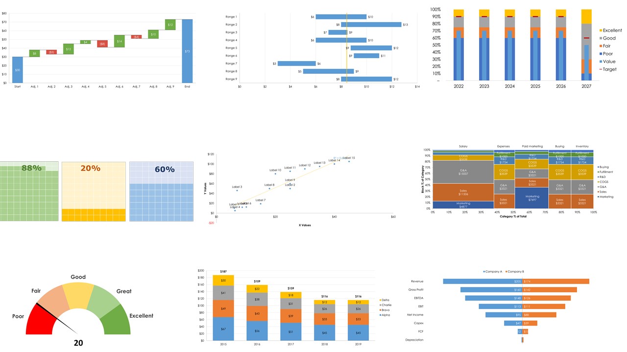
Waterfall chart
There are 12 variation sheets in the model
-
These are used to illustrate any process with additions and subtractions to a starting value.
-
They were popularized by the strategic consulting firm McKinsey & Company in its presentations to clients.
-
Private equity firms would use one to show how they would be able to reduce the cost base to increase the profitability of an acquisition.
-
They're normally a pain to make because they involve using Stacked Column Charts and removing shading and outline on the “hidden” building blocks.
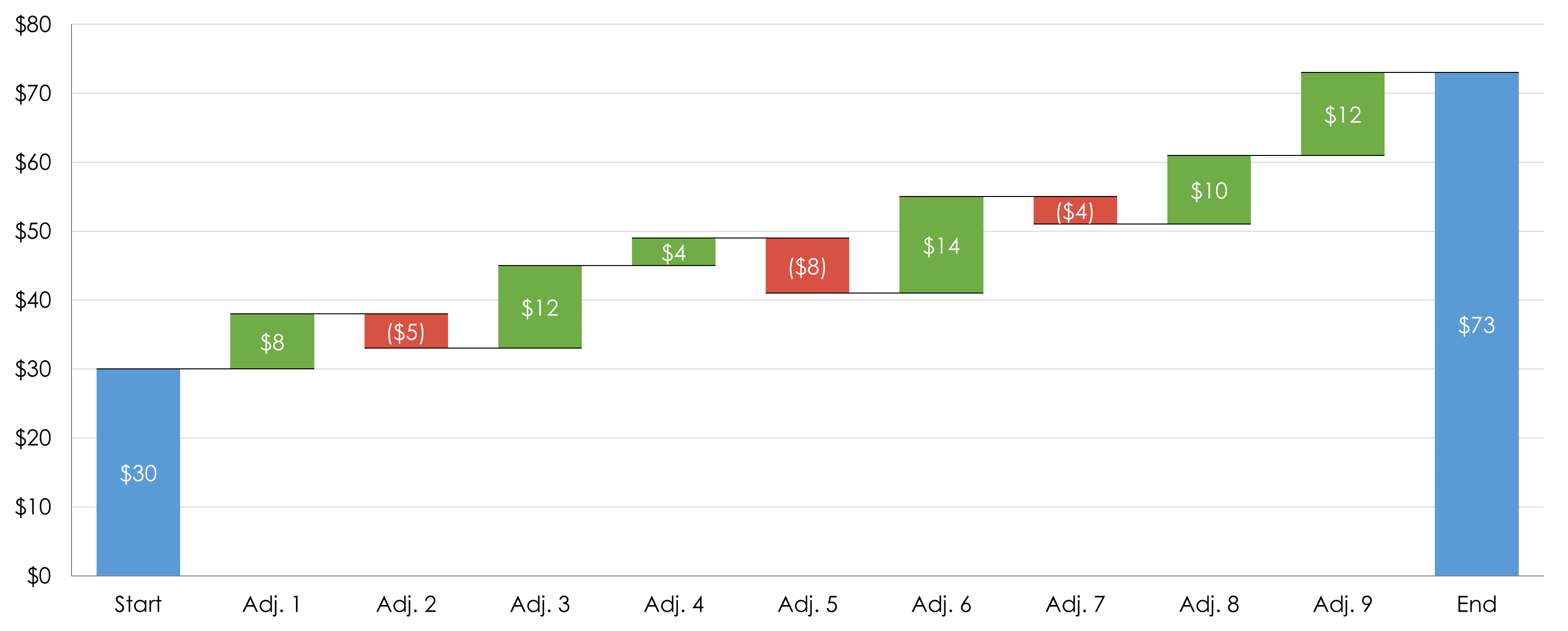
Football field
There are 16 variation sheets in the model
-
A football field is used to compare and summarize different valuation methodologies to value a company.
-
It is commonly used in M&A investment banking.
-
You present a varied range of values to make it simple for clients to see average valuations based on a donkey kong amount of Excel analysis
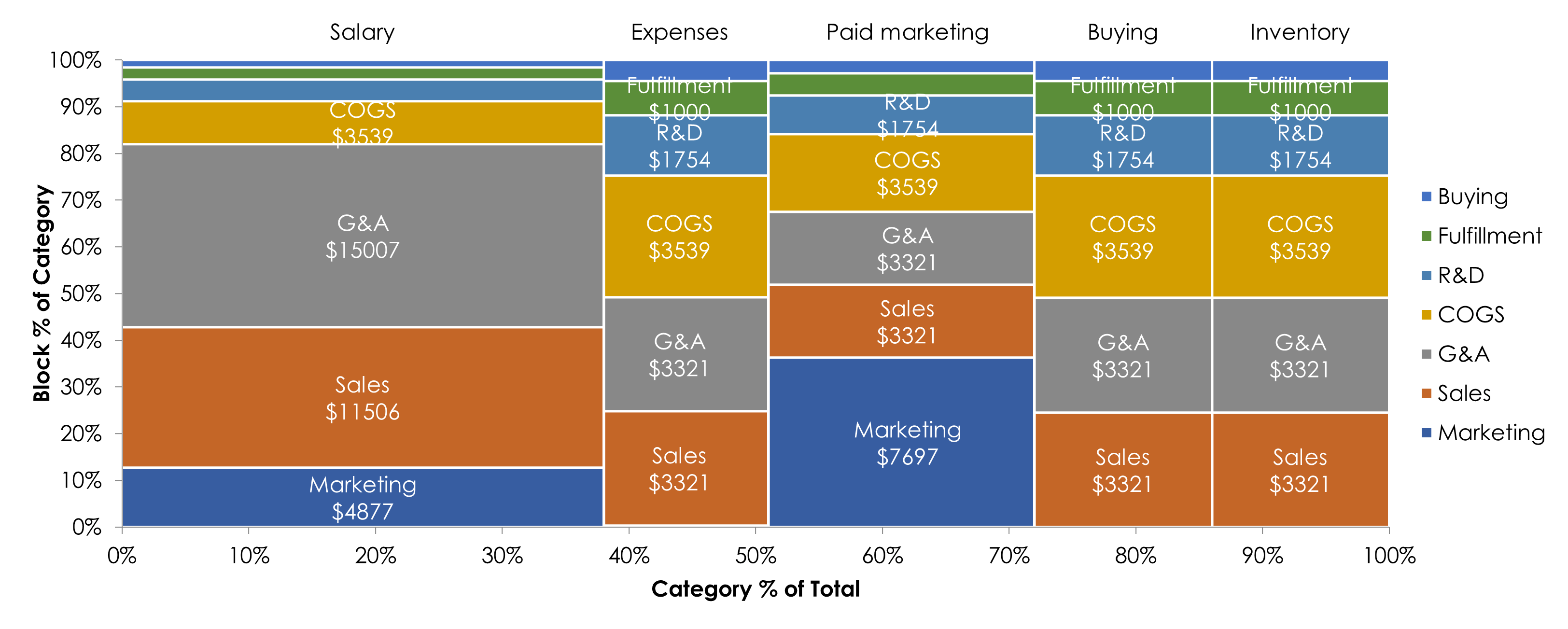
Marimekko
There are 38 variation sheets in the model
-
Marimekko Charts work as a kind of two-way 100% Stacked Bar Graph, and are used to visualise categorical data over a pair of variables.
-
This makes it possible to detect relationships between categories and their subcategories via the two axes.
-
Both axes are variable with a percentage scale, that determines both the width and height of each segment.
-
They can be a little difficult to read if there is a lot of data so are suited to showing an overview
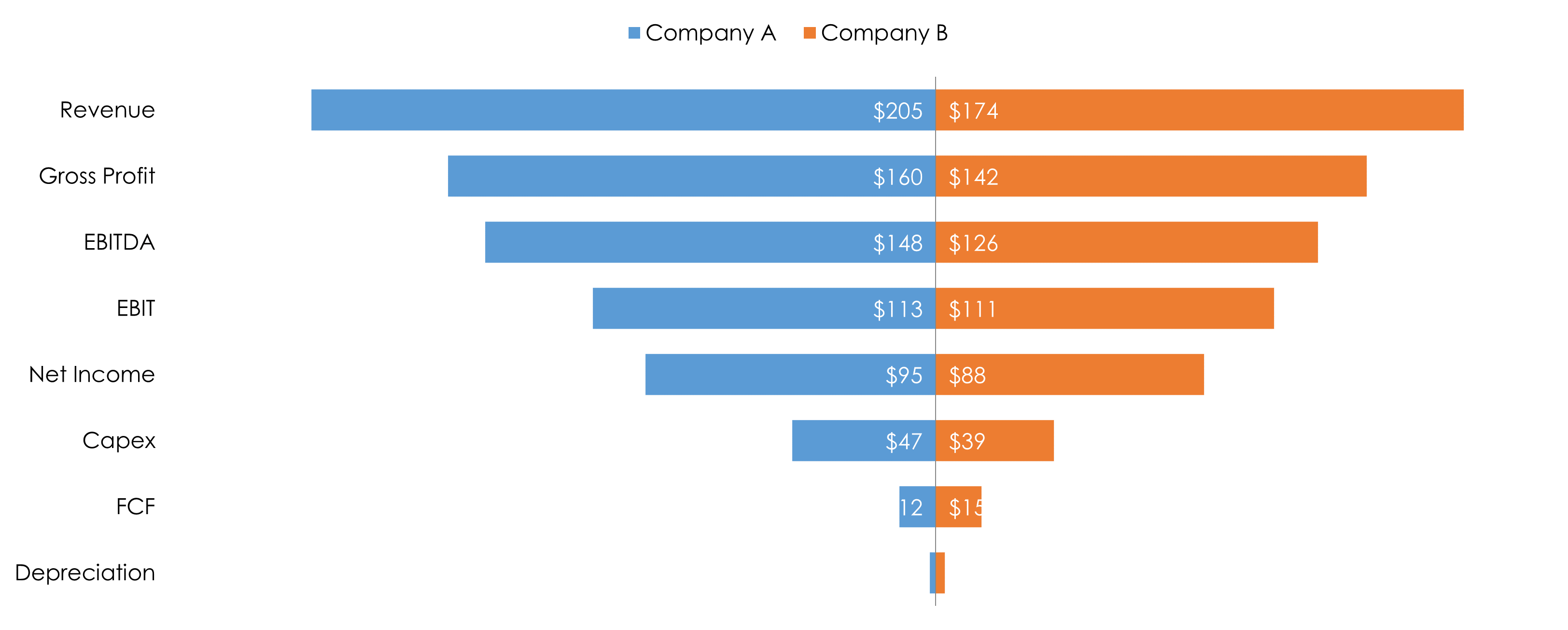
Tornado chart
There are 16 variation sheets in the model
-
Tornado chart looks like a tornado... It is a pair of back-to-back bar charts, which could also serve as histograms.
-
In M&A investment banking you use them to show the combination of two companies in a merger. You can see how revenue down to FCF compare.
-
Some people use it for financial modelling as a graphical means of displaying the results of a deterministic analysis to show the most important input variables.
-
It is also known as an Age & Sex Pyramid or a Population Pyramid. You compare both sex and display the distribution of a population in all age groups and in both sexes. The X-axis is used to plot population numbers and the Y-axis lists all age groups.
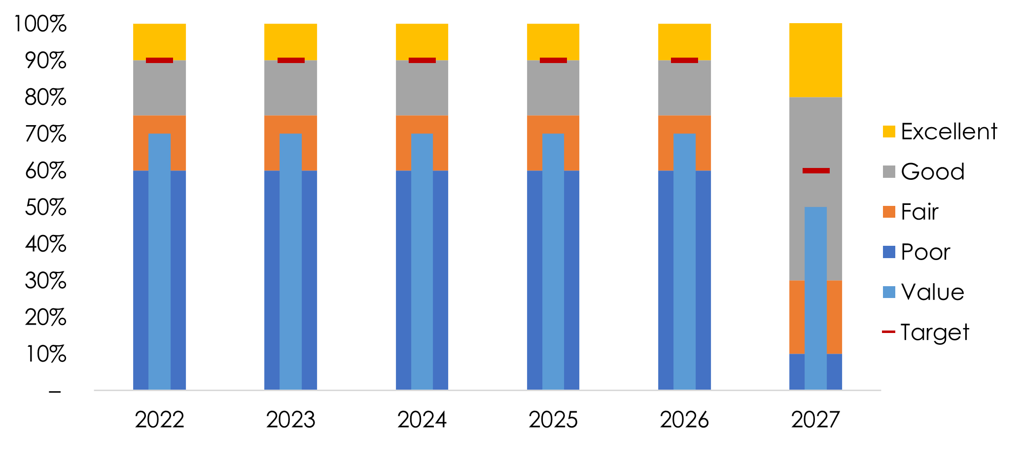
Bullet chart
There are 8 variation sheets in the model
-
Bullet Graphs are used to display performance data
-
The easiest way to think about them is for sales teams. You set what sucks to what is frickin awesome, then you can show the target and what was achieved.
-
They are basically a Bar Chart on acid, accompanied by extra visual elements to pack in more context.
-
They were developed by a dude called Stephen Few as an alternative to dashboard gauges and meters, because they didn't display enough information, were less space-efficient and were cluttered with "chartjunk".
-
The main data value is encoded by a length of the main bar in the middle of the chart, known as the Feature Measure. The line marker that runs perpendicular to the orientation of the graph is known as the Comparative Measure and is used as a target marker to compare against the Feature Measure value. So if the main bar has passed the position of Comparative Measure, you know you’ve hit your goal.
-
The segmented coloured bars behind the Feature Measure are used to display qualitative range scores. Each colour shade (the three shades of grey in the example above) are used to assign a performance range rating. So for example, poor, average and great. When using Bullet Graphs, it's ideal to keep the maximum number of ranges to five.
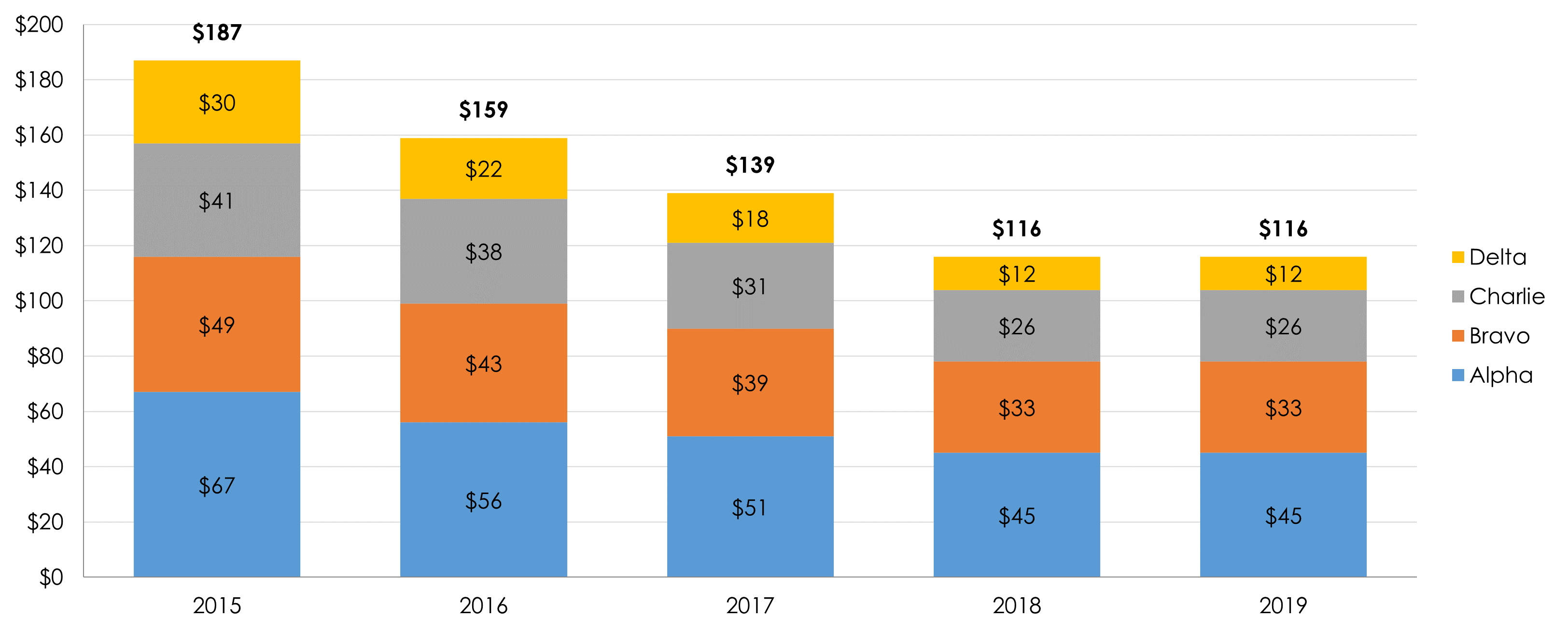
Stacked chart
There are 27 variation sheets in the model
- Stacked charts show how you get to a number.
- There is a total which is divided into smaller categories and what the relationship of each part has.
- They're great to see if how things are getting larger/smaller, and why? If costs are increasing, where the heck are the costs increasing? "Oh, headcount"
-
In M&A you would use this to show the contribution of sources of revenue over time. If you were looking at a asset manager you could see what comes from active vs passive assets.
-
They're one of the most common types of charts you will want to churn out
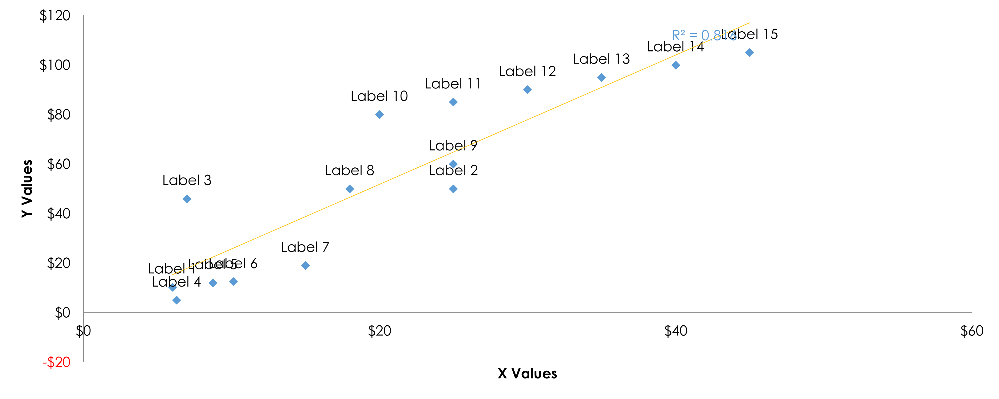
XY chart
There are 4 variation sheets in the model
-
XY simply put, place something on two axis' so you can compare stuff. You show your paired numerical data and that one variable impacts the other.
-
These are used for a huge number of reasons. Equity research analysts will have them in every broker report they write. Nerdy VCs blogging will discuss company valuations compared to others, economists will use them to show how relevant something is...
-
They are a collection of points placed using Cartesian Coordinates to display values based on two variables. The entire goal is to see if you can detect if a relationship or correlation between the two variables exists.
-
In fact, you can add a statistics thingamajig with r2 to see the correlation. If that number is close to one, your data set is highly correlated to the two variables. The strength of the correlation can be determined by how closely packed the points are to each other on along the line of fit (which you can fiddle with).
- I can remember the first time I had to figure out how the heck to make this since no one knew how. It was a pain!
- These are also known as a Scatter Graph, Point Graph, Scatter Chart or Scattergram. I like brevity, so I call them XY
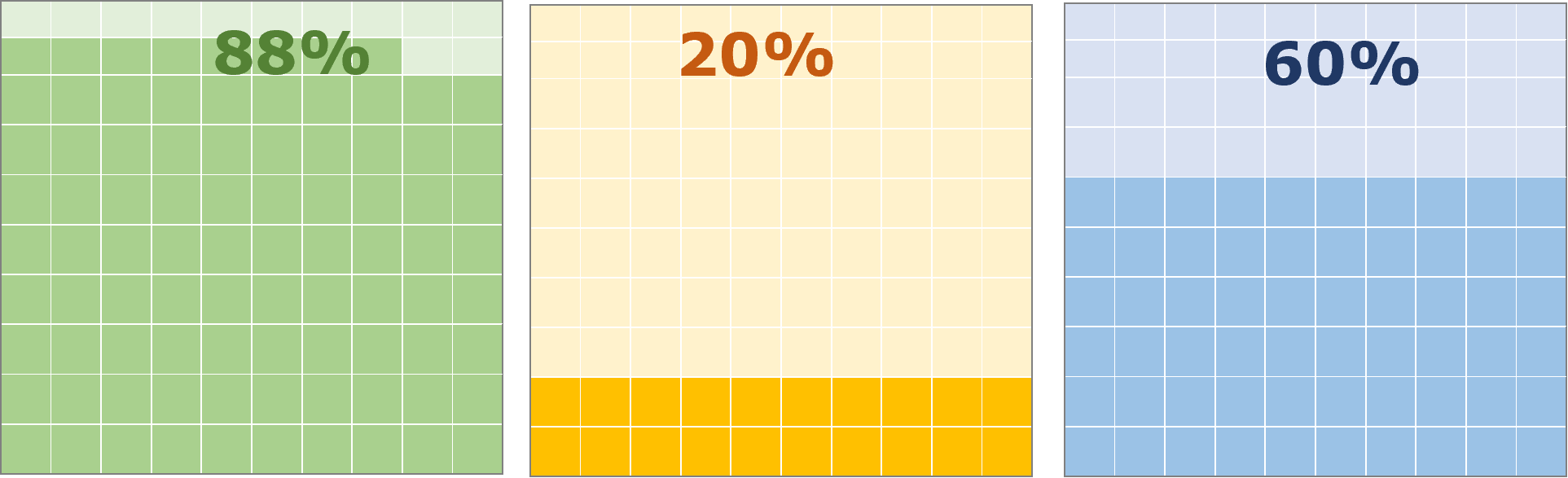
Waffle chart
There is 1 variation sheet in the model
-
A waffle chart is a square display consisting of 100 smaller squares arranged in a 10-by-10 layout. It looks like a waffle... no shite.
-
Each square is coloured according to the proportions, just like a pie chart. When the waffle is full it is 100%.
- These are mainly used for metric dashboards if you want to make your Excel life a bit more sexy. It's not a common chart, but they are not easy to make so I added this as a bonus.
- All you need to do is type in one number and you magically get the chart so it's a no brainer win for you.
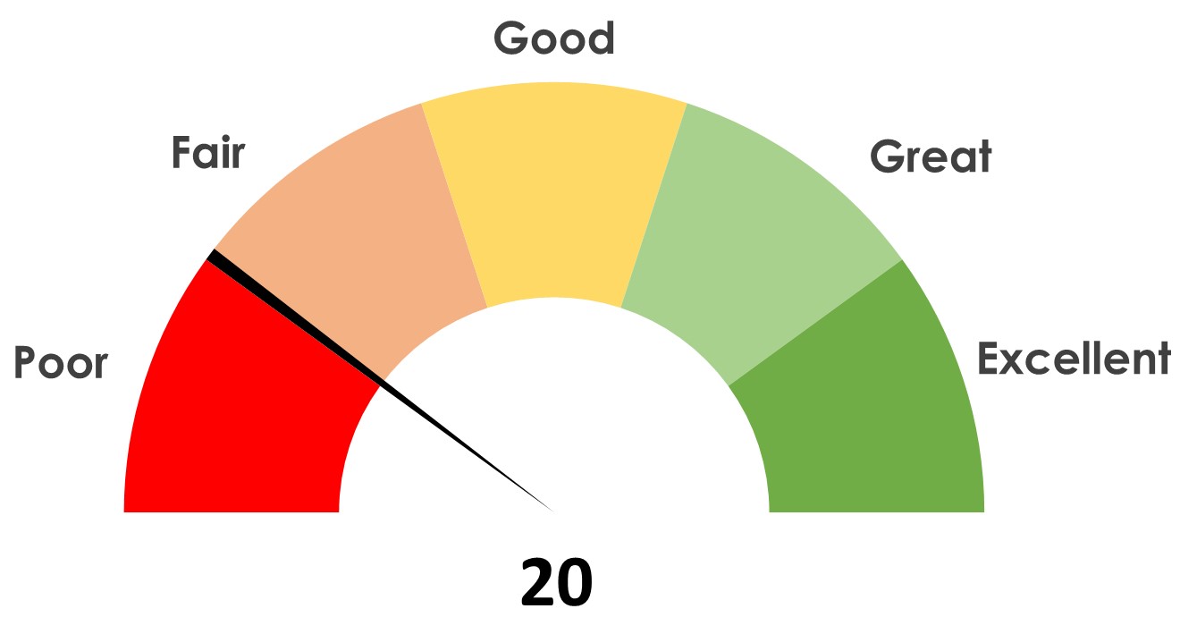
Gauge chart
There is 1 variation sheet in the model
-
A gauge chart show a single data value with a quantitative context. The shape resembles a speedometer tracks the progress of a KPI in comparison to a set target or to other time periods.
- It is not a common chart but it looks pretty cool. It is only really used in metric dashboards.
- Again, not easy to make, but it is easy for you now if you want to make it with zero effort! Why not, right?

Want to know more?
Let's run through details and answer your FAQs
FAQ

Purchase guide and note
Let's just get clear so you know how it works and what to expect
Buying models
Getting the model
- Payment and delivery of the model is 100% automated!
- It's hosted on SamCart and payment is via Stripe (Secure)
- There are no refunds. These are digital goods you can't return
- If you have questions ask me first in the chat or via email
- If you aren't sure if this is for you, don't buy it
- There are max 3 upsell pages after you buy. Press ignore if you want. There is a page where you press download at the end. It downloads to your download folder.
- After you buy you also get a confirmation email from SamCart with the link.
- Delivery of the model via email is automated.
- Note: I don't know why, but occasionally it can take an hour
- The file comes in a zip file. You need to unzip it (e.g. WinZip)
- There is no customer care. Only ping me an email or via chat box if something is specifically broken.