

Tl;dr: This is how you make a chart so that everything starts at 100 and grows from there so you can see the relative growth
Have you ever wondered what stock has performed better or worse over a period of a year? What do things look like a year later? Did one do better than another and by how much?
Well, in investment banking, this is a 101 skill you have to learn to do deals with public companies. As a trader, analysing share performance, it’s something you do all the time. For everyone else, well no one teaches you these things.
Moving on. You want to see relative performance in one chart but the issue is that the shares all have different prices and they fluctuate independently. That’s sort of obvious since each is an individual company, but really you want them to all start at the same place.
If you were doing a 100m sprint you want to start at the same point so that timing is the same.
Only, that involves some math. How do you do that?
Easy. Let me teach you.
Rebasing a chart
Rebasing is essentially bringing all the sprinters in a race back to the same starting point so that their performance is normalised to the same starting point.
Let’s say we have two companies:
- Google: Share price of 100
- Taobao: Share price of 200
Taobao is 2x Google. On a graph that’s clearly not the same starting point. It’s apples and oranges.


What we want to do is to bring Taobao to the same 100 starting point at Google. By doing this every % change over a time period, of say a year, is relative to one another. It’s apples and apples and oranges and oranges.


The math is actually really simple. You just need to know how it works. So let’s learn.
A rebased chart brings everything to the same starting point, showing an absolute price change at each point of time and how the % price changes from the starting date we selected (The rebased date).
There are three numbers:
- Rebase #
- Starting Price
- Ending Price
The formula is
- =(Rebase # / Starting Price) * Ending Price
The rebase number you want to use is 100.
The starting price is fixed, so in Excel you will have a $ around the starting price. If, like in the example model I show, you have the rebase number (100) in an assumption box, you will also have $s in the cell).
- =($L$4/$D$9)*D27
- =($L$4 [Rebase #] / $D$9 [ Starting price])*D27 [Ending price]
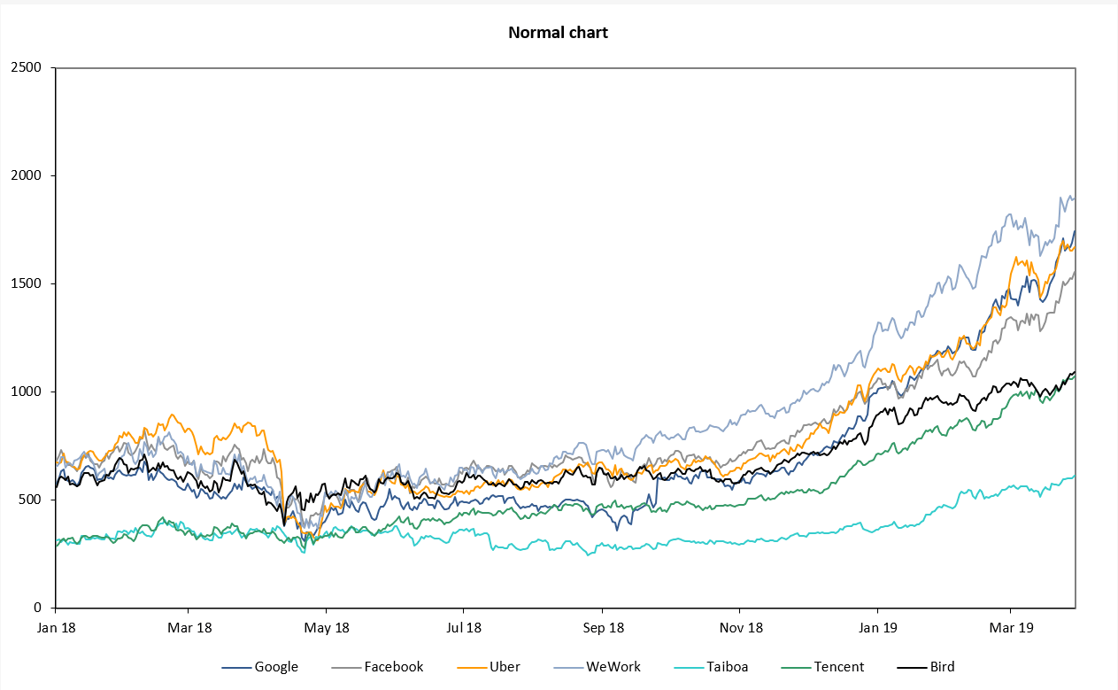
What a chart looks like without rebasing
The share price data is normal, just not from the same starting point.

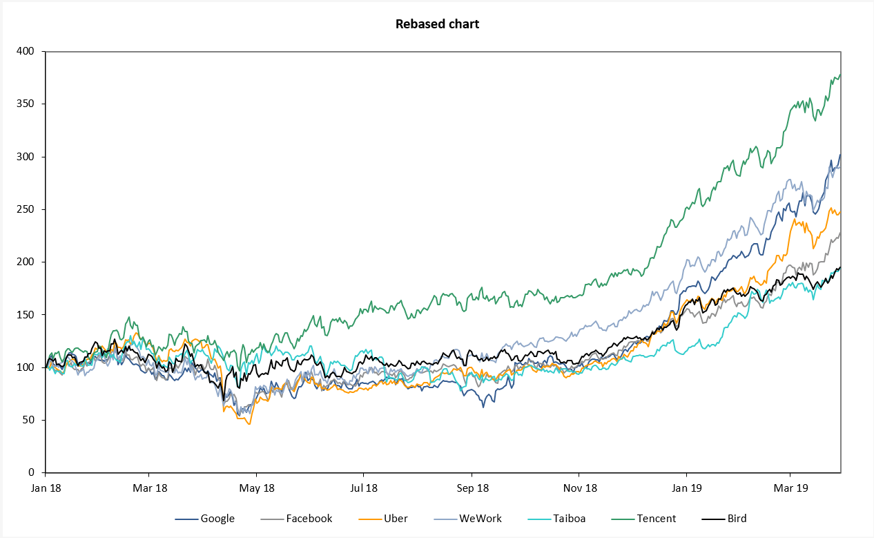
What a chart looks like with rebasing
Looky, looky. Everything starts at 100.

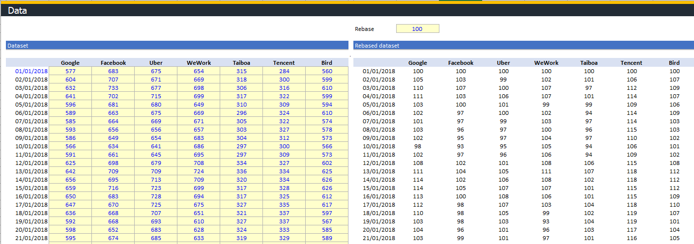
What the data set looks like
The dataset on the left is the unedited share price data.
The dataset on the right is the rebased table. You can see everything starts at 100 and then starts moving around.

Get the free template
I’m sure that was all super-fun reading, but you want to really have a play so you can learn.
So do that. Download the file and have a go! Get the nerd on.